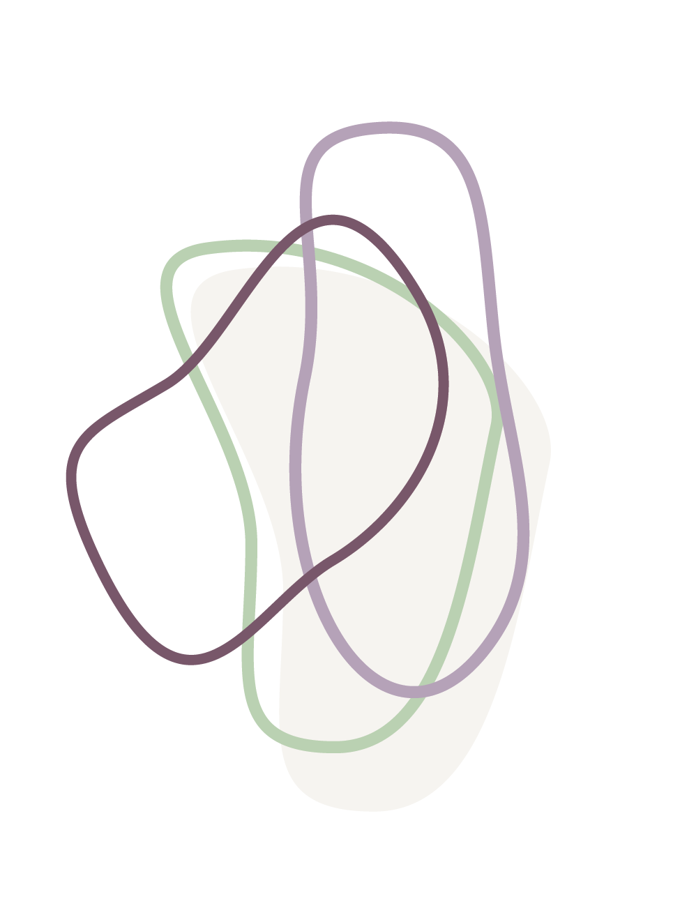
Our New Logo and its Design

We are grateful for Ann Robert’s work and the way she has been able to lead us in the development of a logo that we believe reflects who we are as an organisation.
Ann writes:
“It has been a pleasure to support the Centre for Spirituality of Care and Community through a creative process to develop a logo and small visual identity. Taking ideas and distilling them down into shapes, colours and symbols that communicate our values in the world can be a very refining process for an organisation.
For me, the final gesture of the shapes represent interconnectedness, coming together, weaving and sharing ideas, community, inclusion and the many smaller shapes that we make when ideas intersect, cross over and interact together – creating new possibilities in themselves.
The loops sit slightly higher than the text to represent spirituality, uplifting, and the gesture of higher thinking and knowing as well as putting community and people first.”
